Primary · on dark
White wordmark · three signature tiles

REVOLVING / BRAND RESOURCES
Our name. Our three tiles. Our playful side.
Everything you need to bring Revolving.com and Revolving+ to your next story, project or collaboration.

The wordmark is set in Bricolage Grotesque ExtraBold and always travels with its three tiles: lime, sky, coral.
White wordmark · three signature tiles

Midnight wordmark · deeper tiles for contrast
Small games. Big fun. · from 240 px wide

When the web address matters · press, partners, merchandise
The R icon keeps the three tiles together on a rounded Night background.

Revolving+ adds a lime Plus tile to the logo. The same tile marks everything that belongs to the subscription, on the website and inside every game.
Wordmark · three tiles · lime Plus tile
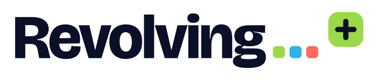
Midnight wordmark · deeper lime Plus tile

The Plus tile is the Revolving+ badge: subscription page, pause menu, member names and Plus-only content. It works from 16 px.
MemberNext to a member’s name in leaderboards and the account menu.
Play without adswith Revolving+The offer row in every game’s pause menu and game over screen.
Included in Revolving+On levels, themes and archive days that come with the subscription.
Midnight sets the stage. Lime, sky and coral bring the play. Lime is also the Revolving+ color.
#0B1028#141D3A#FFFFFF#B6C5E8#C4FA72#56C8F2#FF8275#9BD94ASky deep #2FB2E6Coral deep #FF6B5CBricolage Grotesque for the logo and headlines. DM Sans for everything else. Both are free under the SIL Open Font License.
Display · Bricolage Grotesque
One more round.
Headlines, game titles, prices and scores.
Text · DM Sans
Same puzzle for everyone. Resets at 00:00 UTC.
Body copy, buttons, menus and labels. Arabic, Chinese and Japanese text uses each device’s system font.
A few simple rules for a clean, consistent identity.
Leave at least one tile’s width of clear space around the logo. More space is always welcome.
Use the logo at 120 px wide or larger, the tagline version from 240 px. For smaller placements, choose the icon, from 16 px.
Keep the proportions, the tile order (lime, sky, coral) and the colors. Do not stretch, rotate, retype the wordmark, add shadows or place the logo on busy imagery.
Use the Plus tile only for Revolving+. Never put it on free features, and never change its lime color.